Today Rock, Paper, Shotgun wrote about the Nikopol demo and exposed rather harshly some of it’s shortcommings. I heard about the game some months ago so I just had to play it to make sure they aren’t just nitpicking on silly things and making them sound horrible.
You should download it too. Here, take this link. No, take it, I don’t have a use for it now that I’ve already downloaded it. Aw, you didn’t have to say thanks, your welcome.
Well, I played the demo and finished it and, frankly, RPS was right for the most part. It all starts with the following quote:
Be careful, this demo is not representative of the quality of the game in it’s full version
I know that. This is a demo, the full version will likely be different in some form or other and there will be a lot more content. At least I hope so. But what’s the purpose of the demo if it’s not to be taken as a representative of the full version? If you want opinions or to iron out the bugs, do a betatest or a focus group. I suppose it could be for building up hype or to show the development is still alive and kicking, although I’m not really sure of it’s effectiveness given the design quality shown. Anyways, what follows is a description of my experience as well as a critique of the demo, but be careful, there’s spoilers, so go and play it before reading any further. I mean it.
———————–

You finished the demo already? That was quick! You are not lying to me are you? Mmmmhhh, I don’t trust you, but I’ll give you the benefit of the doubt.
There are some games that have a nifty feature I always appreciate: They let me change the graphics settings before actually running the game, because there’s nothing more irritating than having to launch the game and see how the default change in resolution messes up with the aspect ratio because I happen to have a widescreen monitor. Nikopol … doesn’t have this feature, but at least supports widescreen resolutions.
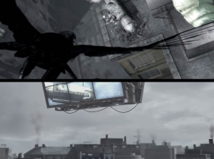
Upon launching the game there was a neat cutscene with a pretty unique style to it. Kind of like a comic but more dynamic. Then, rather seamlessly the cutscene ended in the main menu which is a rooftop on some kind of dystopian city, with symbols spread in the distance. These are the options which you can select when you point the mouse at them. You can move the camera around with the mouse, pivoting to see the whole place, although you can’t move. The whole thing looks nice although it feels rather cumbersome. I don’t know why exactly, maybe it’s because the text for each option is only showed when you point at it with the mouse. Oh well, this is a nitpick at most, the player isn’t likely to use this menu often so it’s excused for putting style over usability.
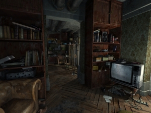
After I grudgingly changed the graphics settings I selected the option to start the game. A minor cutscene plays and then you are dumped into the protagonist’s apartment. Alright, it’s in first person and the mechanics to look around are exactly the same as the ones in the main menu. I still can’t move around. This is the part where I realized just how much detail there is to absorb. The graphic designers deserve a round of applause for this, it feels like an actual apartment were someone probably could live in.

The place looks nice, too nice I may dare to say. The textures and poligons are impressive, yet my computer seems to handle it very well, which is all sorts of surreal given I don’t have a proper graphics card (only an integrated one with the motherboard… yes, I know). How could this be? What kind of witchcraft does this game practice? It was then when I realized it’s not actually rendering anything in 3D. This is the reason why the player is bound to a point in the floor and doesn’t have any kind of corporeal presence when the camera looks down at the floor (not even a shadow of the protagonist is shown).
Each ambient is one single gigantic image stretched to give the illusion that it is actually a 3D space. At least at first you can notice something funny about the camera. The image stretches slightly at the corners giving it that 3D effect but also adding a strange feel to it. It doesn’t seem natural.
Moving on, the overall feel is… depressing. The TV doesn’t work, the bathroom’s mirror is so smudged it doesn’t reflect anything anymore and everything’s dirty. Oh, did I mention that the ceiling is supported by improvised columns and that some of the walls are halfway destroyed? Either the guy is poor or the future’s arquitects are morons. There’s pipes all over the place for… air coniditioning perhaps? At least it looks like it.

I was sadly surprised by the contrast between interactive areas and the level of graphical detail in general. Everything has been manually textured to perfection but less than 5% of the scenery is a “hotspot” for the player to interact with. On the one hand this is good because there’s not many possibilities for complicated puzzles but on the other we don’t have much in the way of experimentation or revealing commentary. The place feels barren because of this. There may be a lot of detail put into the world, but if it’s trivial to gameplay then it’s like it never existed in the first place.
Anyways, the guy is a painter and judging by his comments and, well, everything else, he is really poor. Looking and experimenting around I pick up a chain, a hammer, a chisel, some painting equipment, an old film and a letter at the door. I don’t even know why, but it seems Nikopol has a friend that wants to join a cult or somesuch and the letter is from him. He asks Nikopol to paint a picture of his father.
Yeah.
No explanations, no nothing, just get him the freaking painting like he nicely asked you to. *sigh* I hope this game starts making sense at some point because otherwise it’s going to turn me off rather quickly.
——————
And with that I end the fist part of this critique. Don’t worry, I already have the next part written down, I only need to edit it a little bit and add the rest of the images so it transforms into something more cuddly than the menassing force made entirely out of text that it is right now.
